Excel to Chart Maker
Instantly convert your Excel or CSV data into beautiful bar, pie, and line charts. Perfect for reports, presentations, and data analysis.


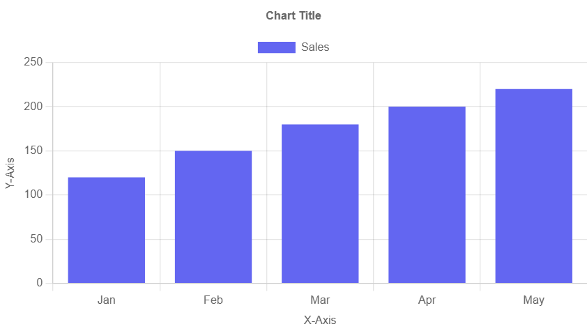
Excel to Bar Chart Maker
Bar ChartQuickly convert your Excel or CSV data into beautiful, responsive bar charts. Customize chart labels, colors, and download as PNG, JPEG, or SVG.
How to Use Excel to Chart Maker
- Prepare your Excel or CSV file. Make sure the first column contains labels and the second column contains corresponding values.
- Click the upload button and select your Excel or CSV file.
- The bar chart will be automatically generated based on your data.
- Use the input fields to customize the chart title, X-axis label, Y-axis label, and chart color.
- Download your chart in PNG, JPEG, or SVG format.
Key Features of Excel to Chart Maker
Fast & Free
No signup required. Generate charts in seconds directly from your Excel or CSV files.
Customizable
Edit chart titles, axis labels, and colors to suit your branding or reporting style.
Multiple Formats
Download your charts as high-quality PNG, JPEG, or SVG files for easy sharing.
Explore More Chart Types
Excel to Bar Chart Maker
Quickly turn Excel data into responsive bar charts.
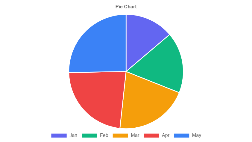
Excel to Pie Chart Maker
Turn your Excel data into colorful pie charts with ease.
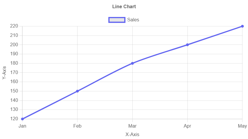
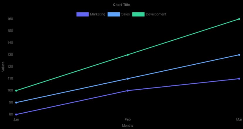
Excel to Line Chart Maker
Plot data trends from Excel with beautiful line charts.
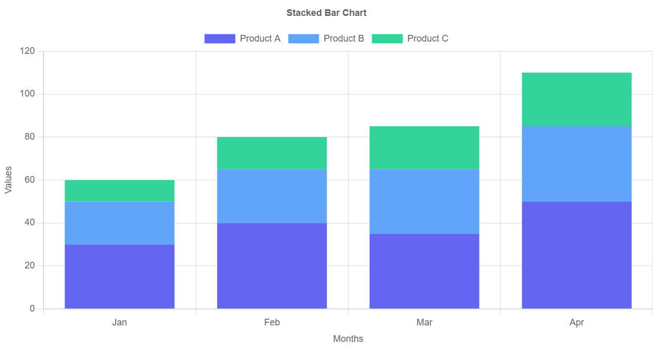
Excel to Stacked Bar Chart Maker
Visualize layered data segments with stacked bar charts.
Excel to Stacked Line Chart Maker
Stack and compare data trends using line charts.
Why Use Excel to Chart Maker?
Whether you're building a presentation, analyzing business data, or preparing a school project, visualizing your data makes it easier to understand and share. Our Excel to Chart Maker helps you create professional-grade charts from .xlsx, .xls, or .csv files in seconds.
Unlike traditional spreadsheet software, our tool doesn’t require installations or complex steps. Just upload your Excel file, customize your chart, and download it in your preferred format. You can generate bar charts, pie charts, and line charts with ease.
Use it for data storytelling, dashboards, reports, academic projects, or content marketing visuals. Start creating charts from Excel online – fast, secure, and 100% free.
Frequently Asked Questions
What is Excel to Chart Maker?
Excel to Chart Maker is a free online tool that converts your Excel or CSV data into beautiful bar, line, or pie charts instantly—no coding required.
How do I create a chart from Excel data?
Simply upload your Excel or CSV file, select the chart type, and we’ll generate the chart for you instantly. You can then download or embed the chart.
Is this tool free to use?
Yes! Excel to Chart Maker is completely free to use for individuals and small businesses.
Which chart types are supported?
We currently support bar charts, line charts, and pie charts. More chart types will be added soon!
Is my data secure?
Absolutely. Your data is never stored on our servers. It is processed entirely in your browser for maximum privacy.